Study Wise


Overview
Study Wise is a responsive web application for students around the world. It gives the opportunity to collaborate with likeminded people and to ease pressures of studying. Connect, share and discuss insights and tasks related to your discipline easily. It will also have a social aspect where peers can arrange meet ups and study groups.
Duration
3 Months
My Role
UI Designer
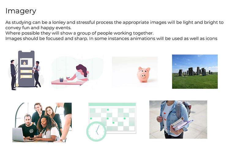
The Challenge
Studying is hard. Today many people choose to study later in life not just after school which can be difficult to immerse yourself back into. With more life responsibilities it requires you to have great time management skills and organisational skills.
It can be extremely difficult to stay enthusiastic however more peer to peer interaction can help make this easier and increase your motivation and engagement with your subject.
Studying is now no longer restricted to the classroom but with access online it can be done on your commute, libraries, coffee shops and in the home.
Proposed Solution
Study Wise is a responsive web application that will allow students to collaborate and engage with likeminded people, it will build a student community where you can meet people in your discipline worldwide to discuss topics, share feedback and information and even have fun.
The Persona

User Stories
In order to empathise with our audience User Stories were also made, these help to understand better our audience in real world scenarios. Keeping these close will help to design something that fits a gap in the market.

“As a mature student I find it difficult getting into the mindset of a student again I'd like to be able to meet likeminded people in order to support eachother”

“As a busy person I want to be able to study whenever I find a spare 5 minutes, I need to be able to do this from anywhere”
Site Map
Based on the information and needs given by my User Persona and my User Stories I looked at the Information Architecture of the app and created a Site Map:

Wireframes
Low Fidelity: Based on the site map I decided to do some quick wireframe sketches. These are intended to be basic to work out some initial ideas regarding layout and not to have too much time spent on making details.


Moodboards
In order to get some ideas and direction about the visual design of the app I created 2 different moodboards. I wanted to get a feel of which design is more reassuring to users.


I decided to do two complete opposites in terms of mood boards, my first option was a very vintage learning experience incorporating the chalkboard and traditional uniform colours with dark wooden desks.
The second was a very modern design, based on a minimalist experience and the 'apple' way of designing. It makes use of whitespace while being accompanied by bright bold colours.
Based on the moodboards I did a preference test with users, the results were :

While users preferred a brighter design the colours made text difficult to read, I decided to go with a modern theme but make the colours a little more subdued.
Digital Wireframes
Mid Fidelity: Keeping in mind my users preferences I then made digital Mid Fidelity Wireframes thinking more about placement and the copy.


Style Guide


Break Points
My design process had focused on mobile first however at this point I started to think about the different breakpoints and scaling my design up. I chose to do this on 3 devices, Mobile, Tablet and PC/Laptop.


Check out how to sign up below:
Reflections
Tools
- Invision

- UserCrowd

- Giphy
- Sketch

Learnings & Future Plans
Whilst this project was also a UX project I was able to focus more on the UI in terms of design and the methodology that goes into this. I found it valuable to constantly keep the design brief close and felt that this provided a useful guide in terms of what the user wants to see and how they interact with my design.
Going forward I'd like to revisit this project and simply focus on one feature such as the calendar to develop this further.
Other projects that may interest you:
