Wayfinder

For the travelling Scavenger Hunter


Overview
The idea behind the concept app Wayfinder was to bridge a gap in the market for gamers and travellers. People want to have new and fun experiences while travelling and still learn about where they are going, the best sights, hidden gems etc. Wayfinder is the answer to this problem.
Duration
9 Months
My Role
UX/UI Designer
The Challenge
Gaming is great but the best are the ones that you can play socially with friends, family or even new friends. Gaming is also a great medium to learn new things and have great new experiences.
Travelling has now become more commonplace and accessible for everyone from all different backgrounds. With so many places to go and things to see and do it can be hard to find holiday activities that suit your wants and needs.
It can be challenging to find activities and be confident that you haven't missed anything, this often leaves you coming home with a ‘I wish I had know this before’ mentality.
The challenge is to create a responsive web app that addresses this.
.
Proposed Solution
Wayfinder is a web application that will allow users to learn about new cities and sites all over the world while still having fun and playing socially. It combines all the fun of a Scavenger Hunt game with the travel knowledge of Trip Advisor.
Research Methods
Check out my process below, click to jump to each section:

Research
Competitor SWOT Analysis
There are a number of competitors in the market of scavenger hunts, the two most popular being Geocaching and Huntzz. I then did some research on these to create SWOT profiles I looked at the strengths, weaknesses, opportunities and threats of each.

Aim: Create a polished product to compete with existing ones but adding a new fun element that doesn’t yet exist in the market.
User Stories
In order to empathise with our audience User Stories were made, these help to understand better our audience in real world scenarios. Keeping these close will help to design something that fits a gap in the market.
“As a person new to the area I want to quickly find hunts near me so that I can get to know my surroundings while having fun and potentially meeting people”
“As a new user I want to sign up easily focusing on my requirements and location so that I can start playing quickly without having to spend too much time customising my preferences”
Surveys & Interviews
Although I have created User Stories I then decided to carry out surveys and interviews to give some real world data to my theories. I created a survey in Typeform to give me some quantitative data while at the same time interviewing 3 people in my target audience to get qualitative data. I was looking to get some pain points from existing products as well as some ideas as to what people would like to see.
With the information gained from the User Surveys and Interviews I was then able to create a problem statement. This will then allow me to focus on this from the users perspective.
“A social gamer needs a way of having new and unique experiences while still getting a sense of achievement from gaming.
Because there are a large variety of games out there it needs to keep the player engaged and have a social aspect.
We will know this to be true when we see a large community playing the hunts but also participating in creating hunts.”
I also did some affinity mapping to find common themes and trends. Here are the key takeaways:
- The thing users felt most strongly about was their privacy, whilst all being on social media they do not want any online activity published there. We need to make a way to save progress without linking to social media.
- We need to make sure to reduce frustrations in the game by making sure that the hunt cannot be sabotaged.
- Some users would pay however some wouldn’t, there needs to be options to suit all such as paid plans or ads to monetise an otherwise free app.


User Personas
Using the results I got from the User Surveys & Interviews I created User Personas to represent the common needs and wants of the audience. This is something I will then be able to keep referring to throughout the design phase.
 |  |  |
|---|
Journey Maps & User Flows
Creating personas helped me to understand the users however I wanted to take this further and map out the journey, this showed me potential opportunities, their feelings and thoughts.


Card Sorts
In order to look more into the Architecture of the application I decided to conduct and Open Card sort as I felt this would give me more information about how potential users think and categories information. A total of 10 people participated in the Card Sort and the results reaffirmed most of the architecture I’d already created. There was a little bit of ambiguity in some of the naming so I was able to tidy up the headings to make things very clear for my users.


Site Map
Before completing the card sort I had created a Site Map in order to show an overview on how to navigate the app. Once the Card Sort was completed it seemed to confirm that most users would understand the Architecture however only a few minor tweaks were made in terms of making headings clearer. There were a few variations for example ‘hunts’ ‘hunt’ ‘start hunt’ so I decided to make these a little clearer.

Design & Prototype

Wireframes
Low Fidelity: I then came to the point where I have all the research now I needed a product to test the theories I have, at this point I crated Low-Fidelity wireframes, these were to be very basic and because I knew there would be a lot of changes it was important for me to not get too bogged down in perfecting it at this stage.


Mid Fidelity: Using Adobe Xd I then created Mid-Fidelity Wireframes that included a little more detail than before and a few small amendments to help improve the flow.


High Fidelity: High-Fidelity Wireframes were then created again in Adobe Xd however in doing this it did show some basic flaws in the design so far, I was then able to correct this before going into the first round of user testing. For example some of the icons used on the hunt screen were a little confusing in terms of functionality so these were moved into the filter menu as this is more likely where they will be used. Removing them from the main screen also gave more space for important hunt information.


Test
Usability Testing
I asked 6 testers to try 3 different task scenarios and talk through their thought process as they went. I wanted to understand if the tasks were intuitive enough for them as users and any pain points they may have come across as they progressed through the task.
I then used Jakob Nielsen’s 5 Components of Usability in order to rate the severity of any issues the testers came across.


A/B Testing
With the introduction of Dark Mode in Apples iOS13 there is a lot of buzz about if this will be a more popular preference. I decided to test a dark theme in the sign in screen. You can see from the results that, although close, the preference is actually the light mode.
I also tried out two colour schemes that could potentially speak to the purpose of the app, one using an outdoor colour scheme and one using a tropical travel scheme.


As the design progressed it was clear that the colours where not accessible and didn't offer enough contrast therefore these were amended at this stage.
Refine
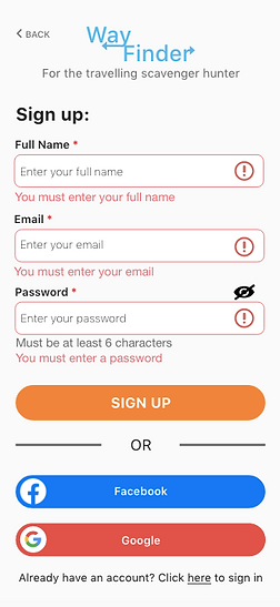
Usability Testing

3
4
5
I again asked for feedback regarding my designs and the images on the left show a number of changes made.
1- There were too many fields to fill in some of which were not necessary, by removing them it will make the sign up quicker for the user and the space cleaner.
2- The back arrows are too small on the page so this was increased and also has the standard touch area 48dp
3- I received feedback that the logo I had previously was too 'old world' in style where as the rest of the app was more modern. This created a mismatch in style therefore the logo was updated to fit in with the rest of the design.
4- The fields here needed more space and due to removing some of the unnecessary fields I was able to do this.
5- I also updated this to Google red as feedback suggested the blue was too similar to the Facebook blue.
Style Guide
Based on all the feedback, amendments were made to the design taking into account accessibility, I therefore created a style guide so any future changes that may need to be made can follow these guidelines and keep consistency in the design.
Colour
#FF7F00
#FFB163
#FFDBB8
#EBD7C3
#31B4F2
#6DCBF8
#B4E7FF
#E2F6FF
#E2574C
#FAFAFA
#F5F4F4
#6AC259
#E3DFDF
Icons

Logo

Images


Based on all the feedback, amendments were made to the design taking into account accessibility, I therefore created a style guide so any future changes that may need to be made can follow these guidelines and keep consistency in the design.
- Images must be high resolution
- No black and white images
- Must be bright and attractive

Buttons & Form Fields


Text


Accessibility
In order to keep the design as accessible and inclusive as possible for a broad range of individuals the below steps must be followed:
- Keep colour contrast adequate, use contrast checker at regular intervals
- Use no less than 12pt text
- Keep in mind usage of a wide number of devices
- Icons to be used with text where possible
- Touch area should be at least 48dp by 48dp on all icons
Measure
A further round of testing was done with colleagues and these designs were updated in the Adobe Xd Designs. The feedback was sorted into required updates, nice to have and positive feedback. Required feedback was updated straight away, the nice to have comments were then looked at and the ones that added most value were updated also.
Here is what the final version of my design looks:

Reflections
Tools & Methods
- User Interviews
- Adobe Xd

- User Journeys & Flows
- Sketch

- Card Sorts
- Survey Monkey

- UserCrowd

- Wireframes
Learnings & Future Plans
Creating a mobile gaming app that is a responsive web app has its challenges. I feel that with more time and better resources it would be good to investigate the benefits of this being a native app, games such as Candy Crush, Garden Scapes and even Geocaching are all native apps so I feel this could have some benefit especially when being used on the go.
I learnt that testing refining and testing again is of the upmost importance when working on a project like this, a number of times my thoughts were not what my users wanted so had to be redefined. I found it is important to take personal opinions out of the design process and make sure to get a fresh perspective.

Click Here to try Wayfinder
Other projects that may interest you:
